GYMSHARK SPORTS APPAREL REBRANDING
Brand Identity, Logo Design, Promotional Design, Packaging, Digital DesignGYMSHARK is a British fitness apparel and accessories brand. The current brand is gaining popularity only in European countries and promotes itself through viral marketing only. The purpose of rebranding GYMSHARK is to be more familiar with active people and gym lovers beyond Europe. In addition, this rebrand will aim to enhance its popularity outside of social media and online platforms to bring the brand closer to potential consumers and grow GYMSHARK into a more developed company.
GYMSHARK began life as a supplements company before moving into clothing.
+ began in 2012, from a garage in Birmingham, UK.
+ began as a health supplement company.
+ moved into clothing in 2012.
+ has customers in over 230 countries with 14 online stores.
+ works with over 900 employees across offices in five regions.
The initial GYMSHARK apparel was sewn and screen-printed by Francis, his brother, and a group of friends after Francis’ grandmother taught him how to use a sewing machine.
GYMSHARK’s new identity is driven by the founder, Francis. How Francis, just a business school student, began the brand GYMSHARK without knowing to design apparel but because of his interest in gym apparel. The rebranding of GYMSHARK follows the pathways of Francis’s Fearless Approach to his dream and passion.
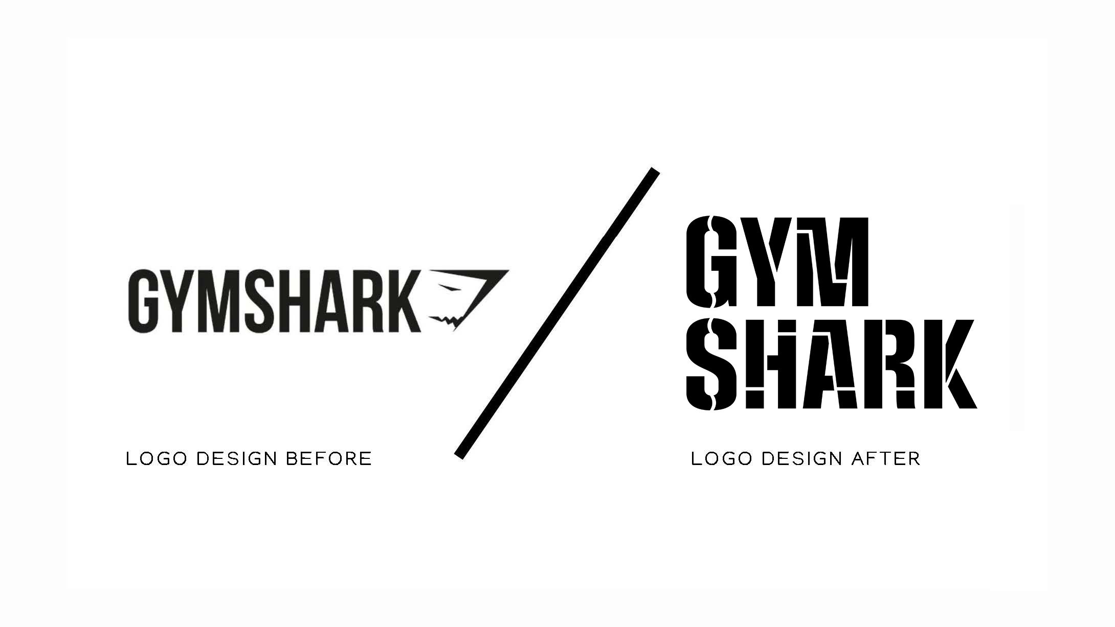
Challenges
+ needs to enhance its popularity.
+ small business with a short history.
+ better marketing strategy required.
+ needs to survive among main competitors.
+ lack of emotions.
+ no offline stores.
+ outdated logo design.
+ need for more communication.
Solutions
+ design update logo.
+ create a universal design.
+ includes the brand story.
+ lean on confidence branding.
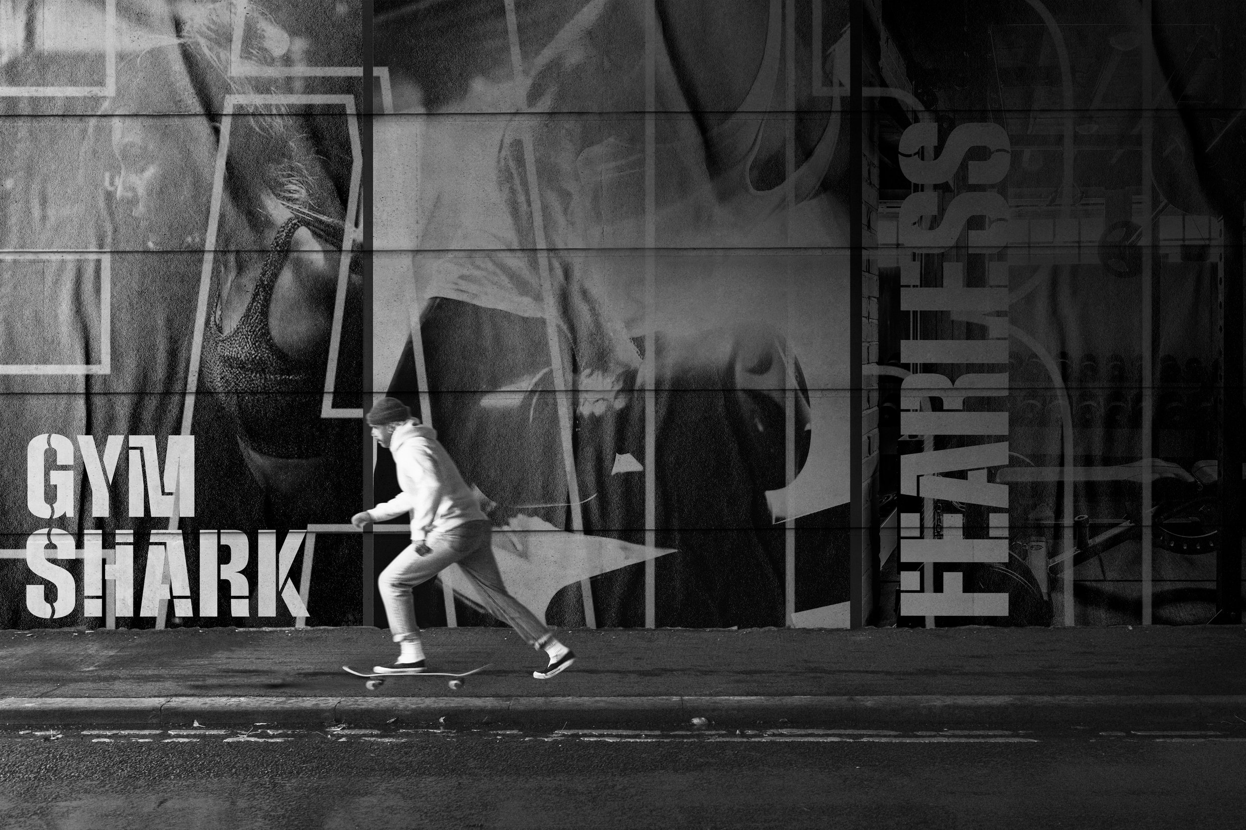
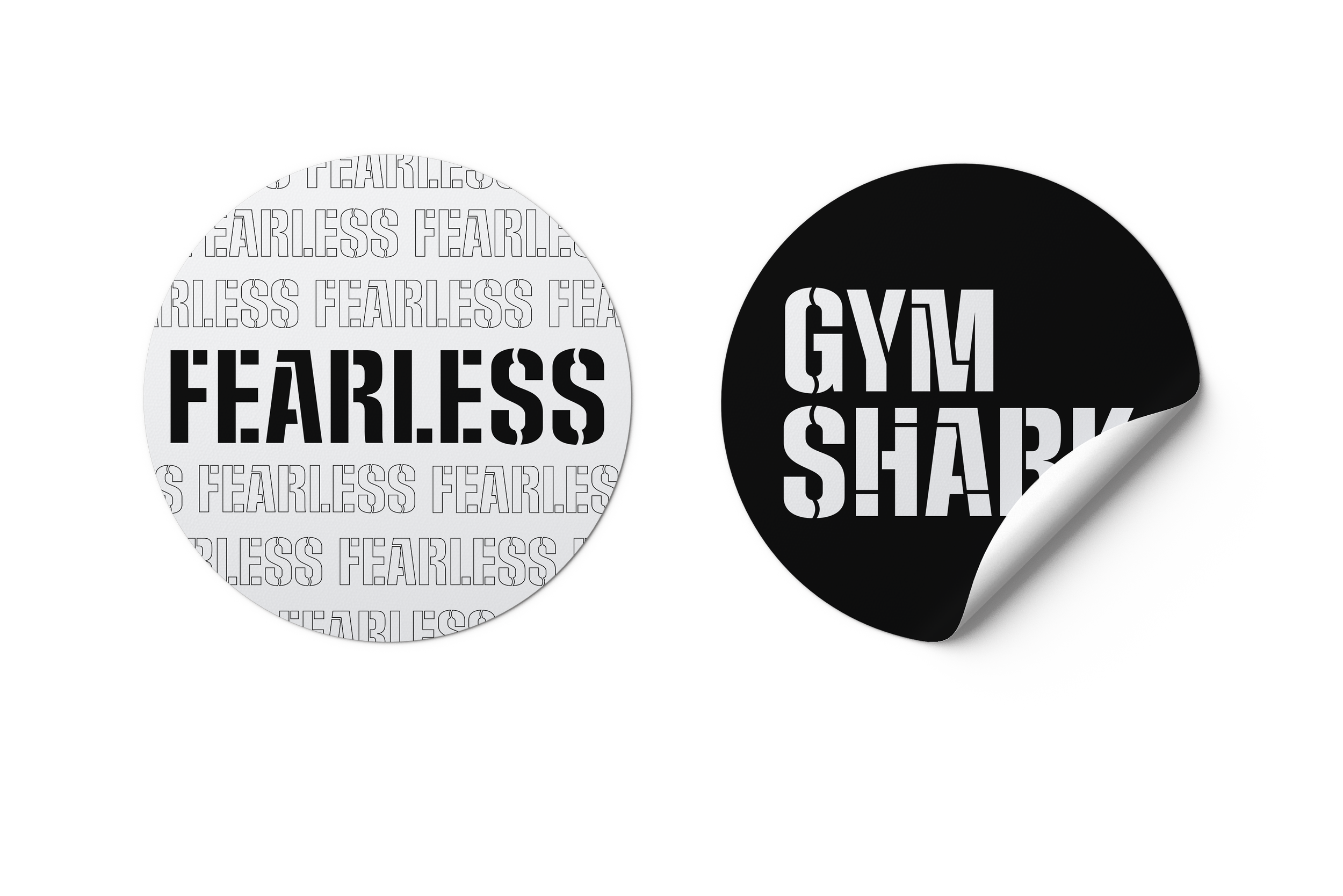
Fearless is the tagline of GYMSHARK.
This motivates people out there to be fearless of anything, whether a person is a gym person or not.

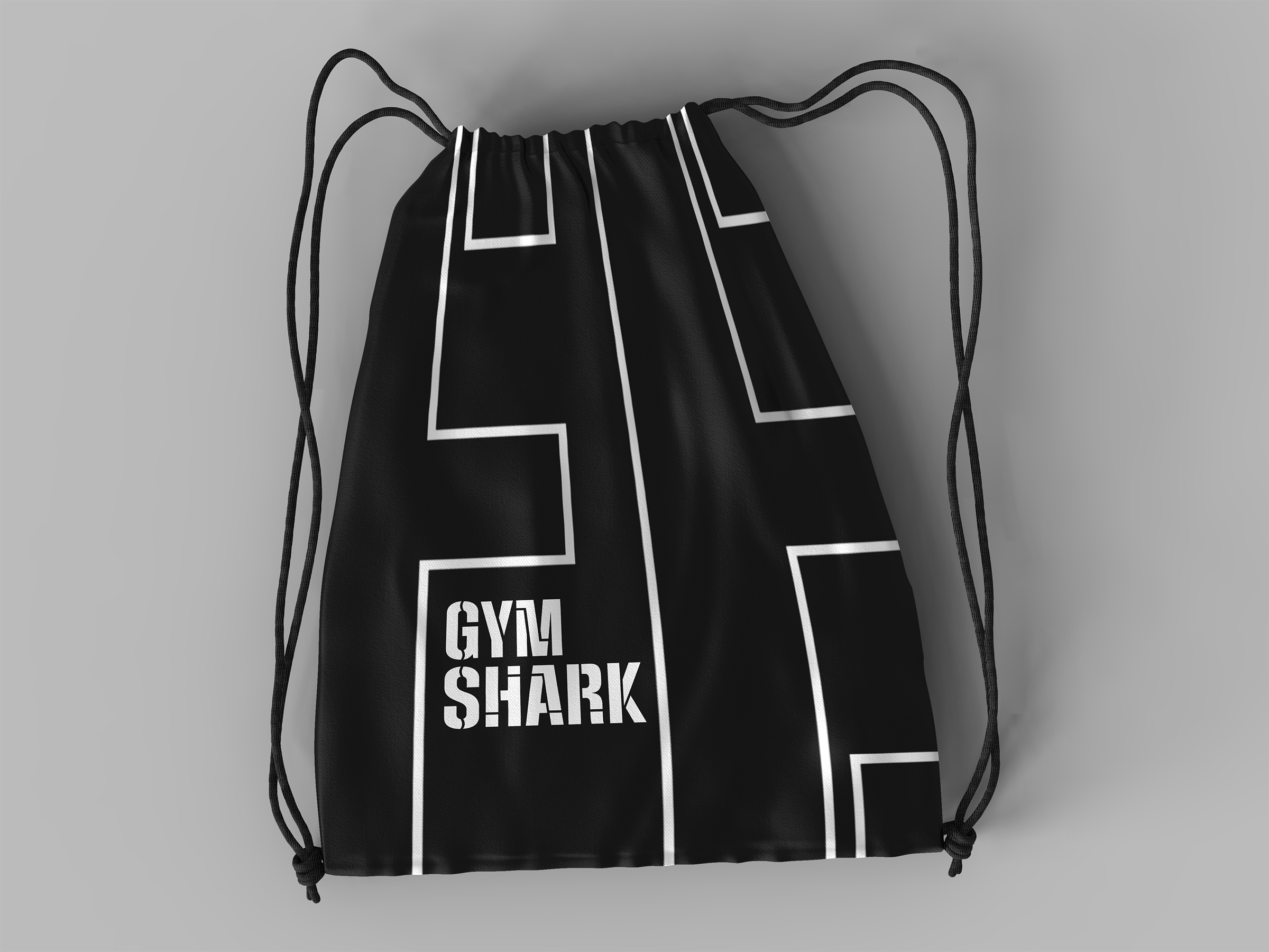
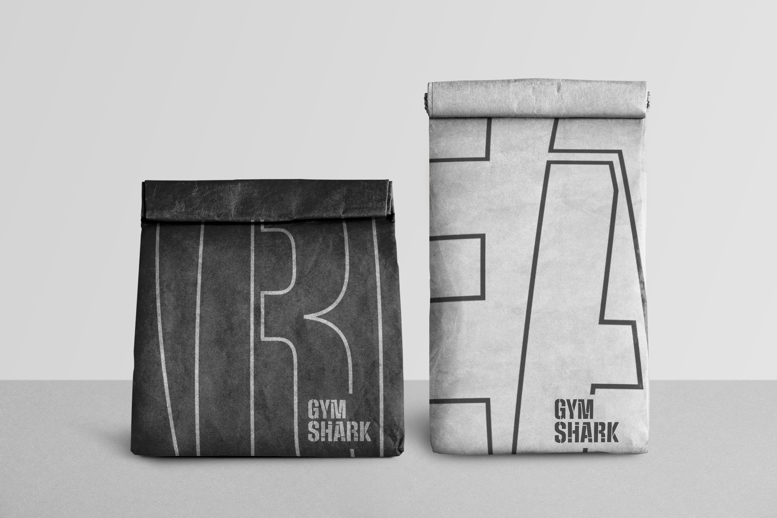
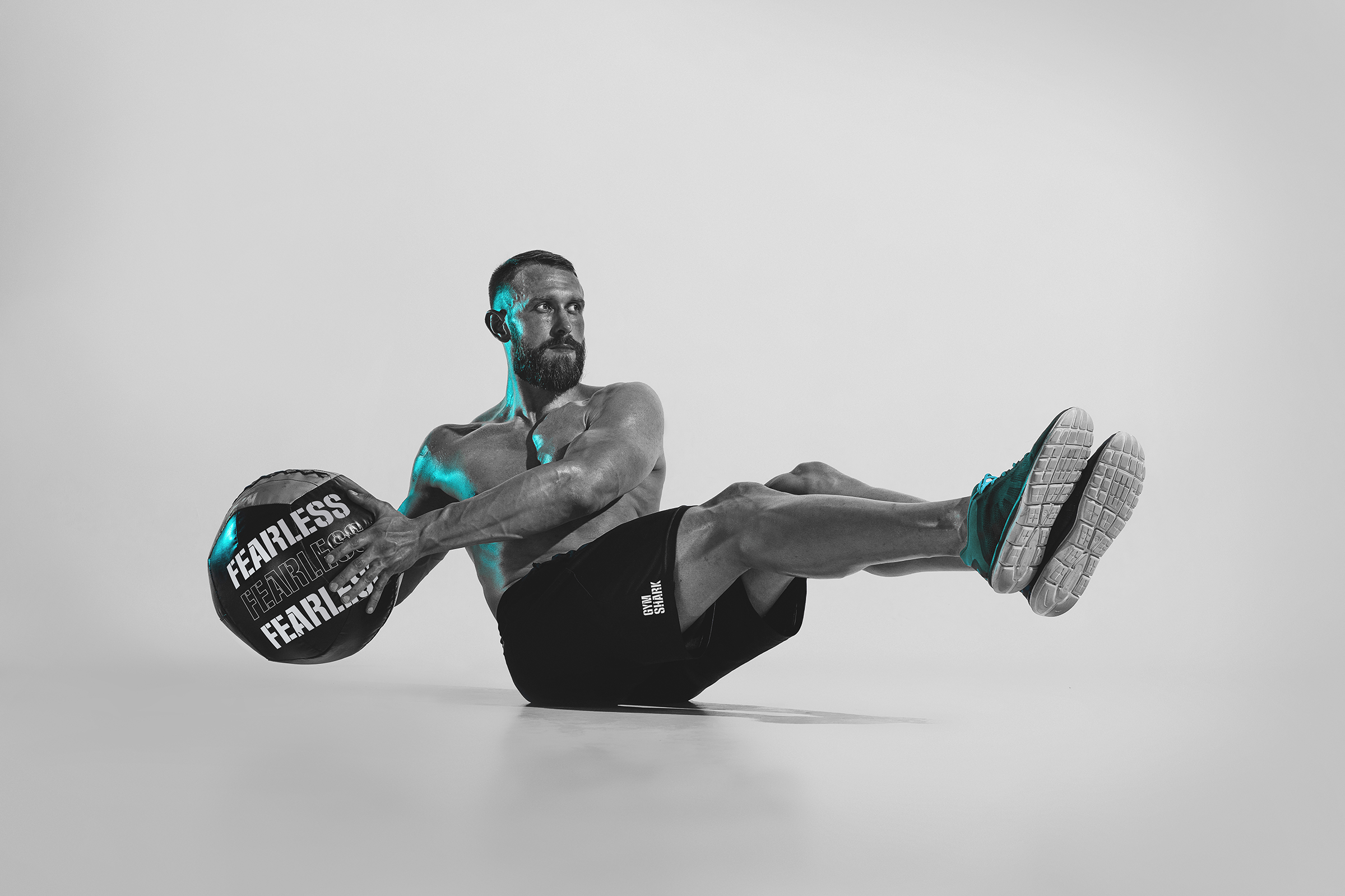
GYMSHARK's signature gym equipment and essentials; Wall ball, Duffle bags, Dumbbells, and String pouch. 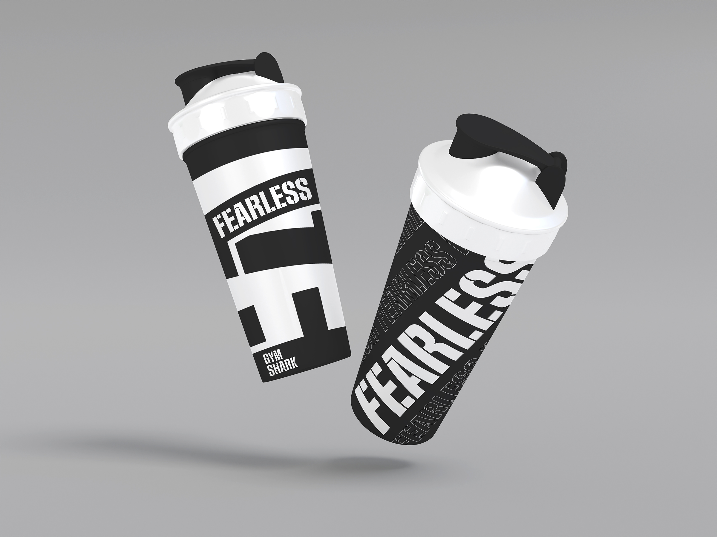
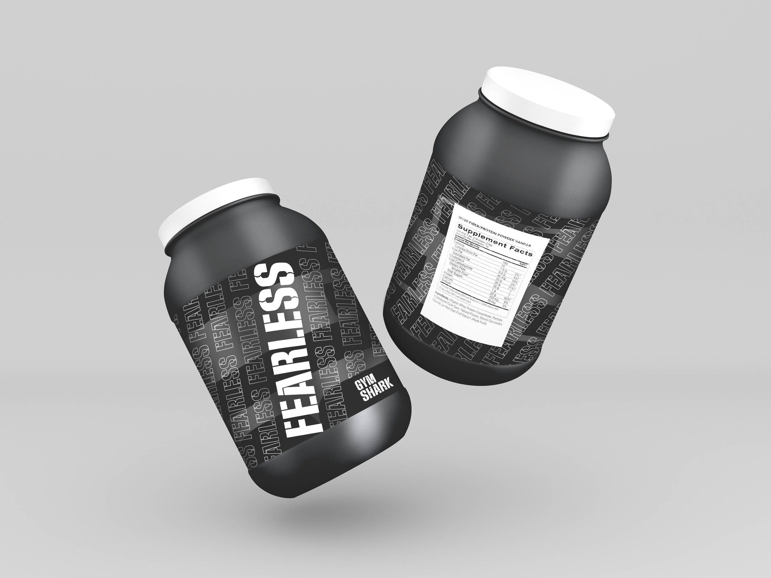
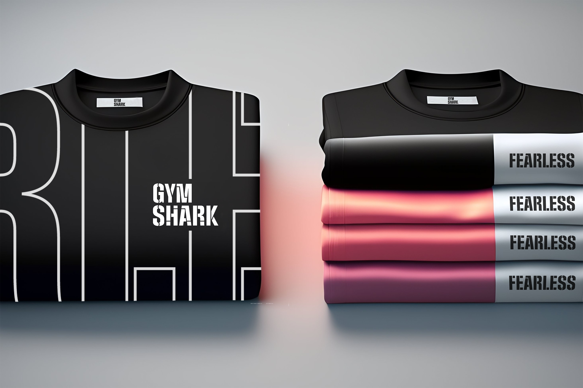
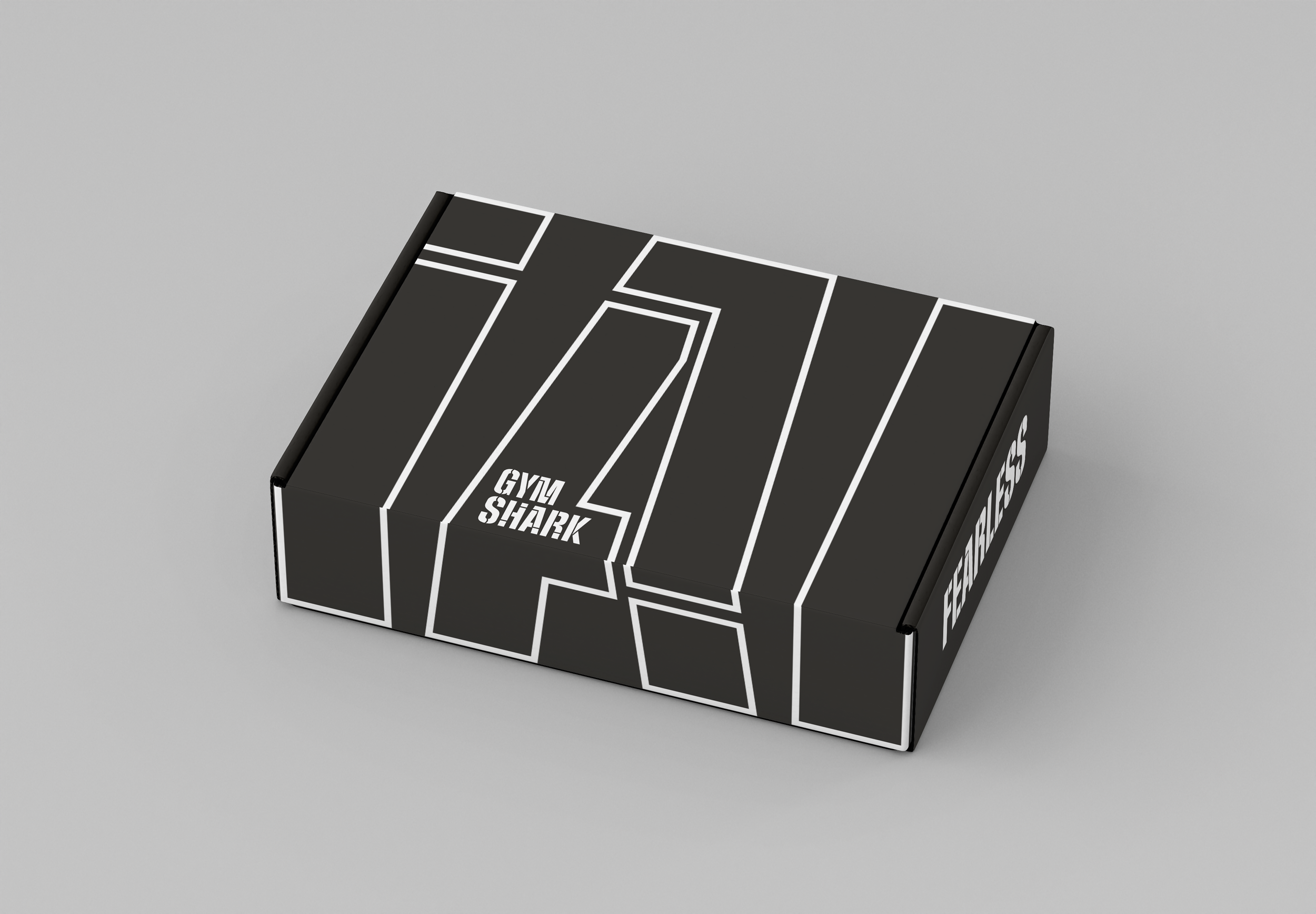
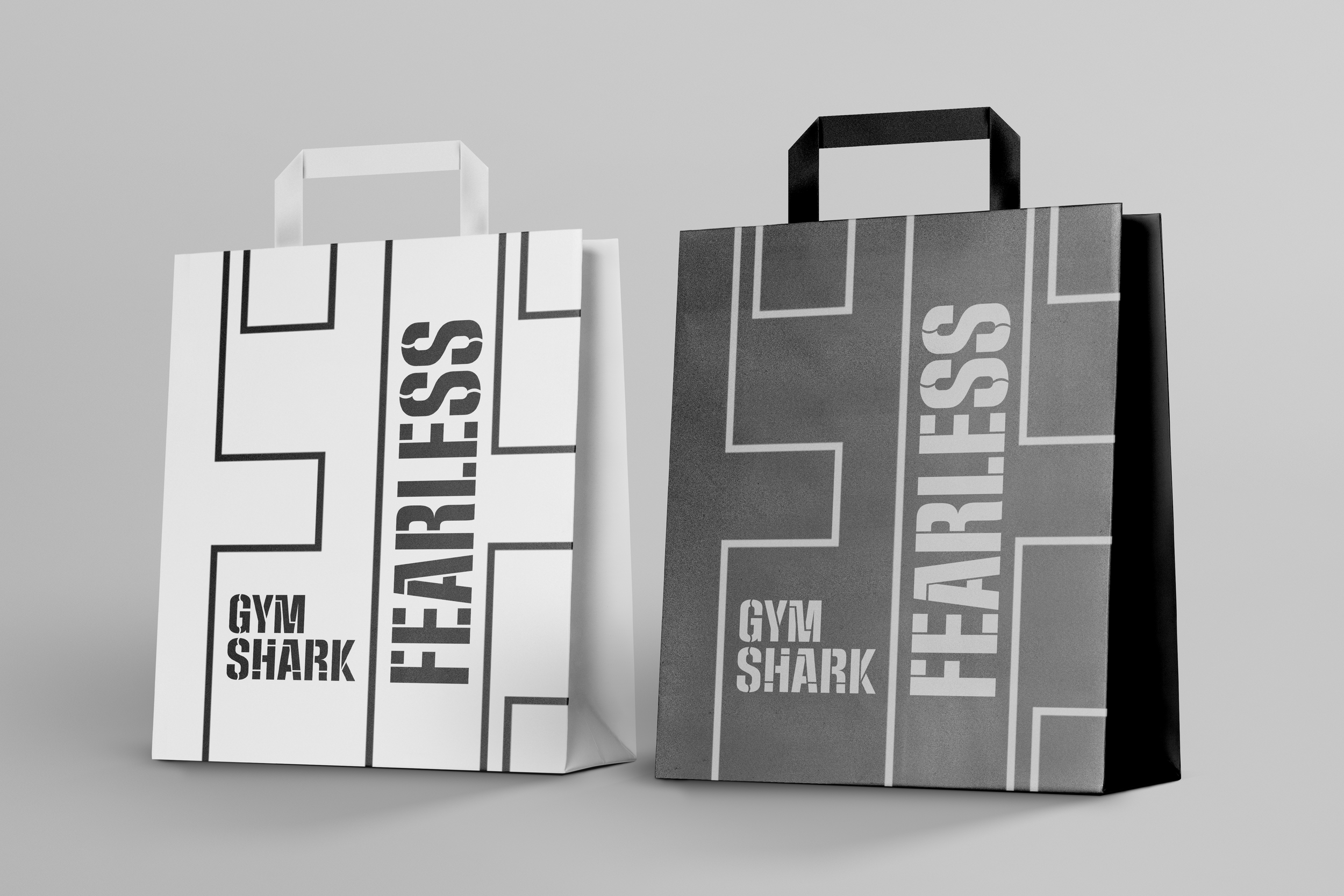
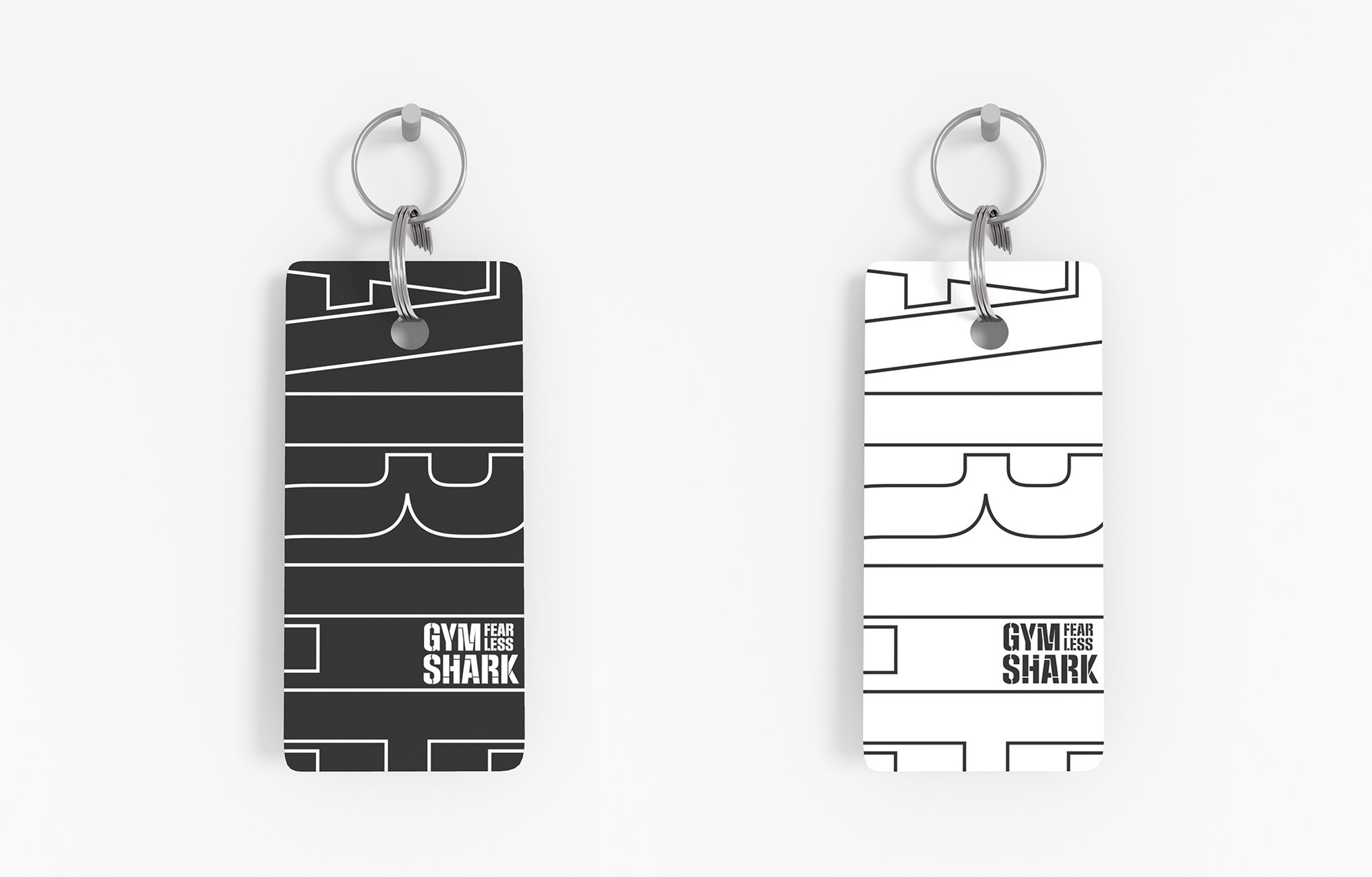
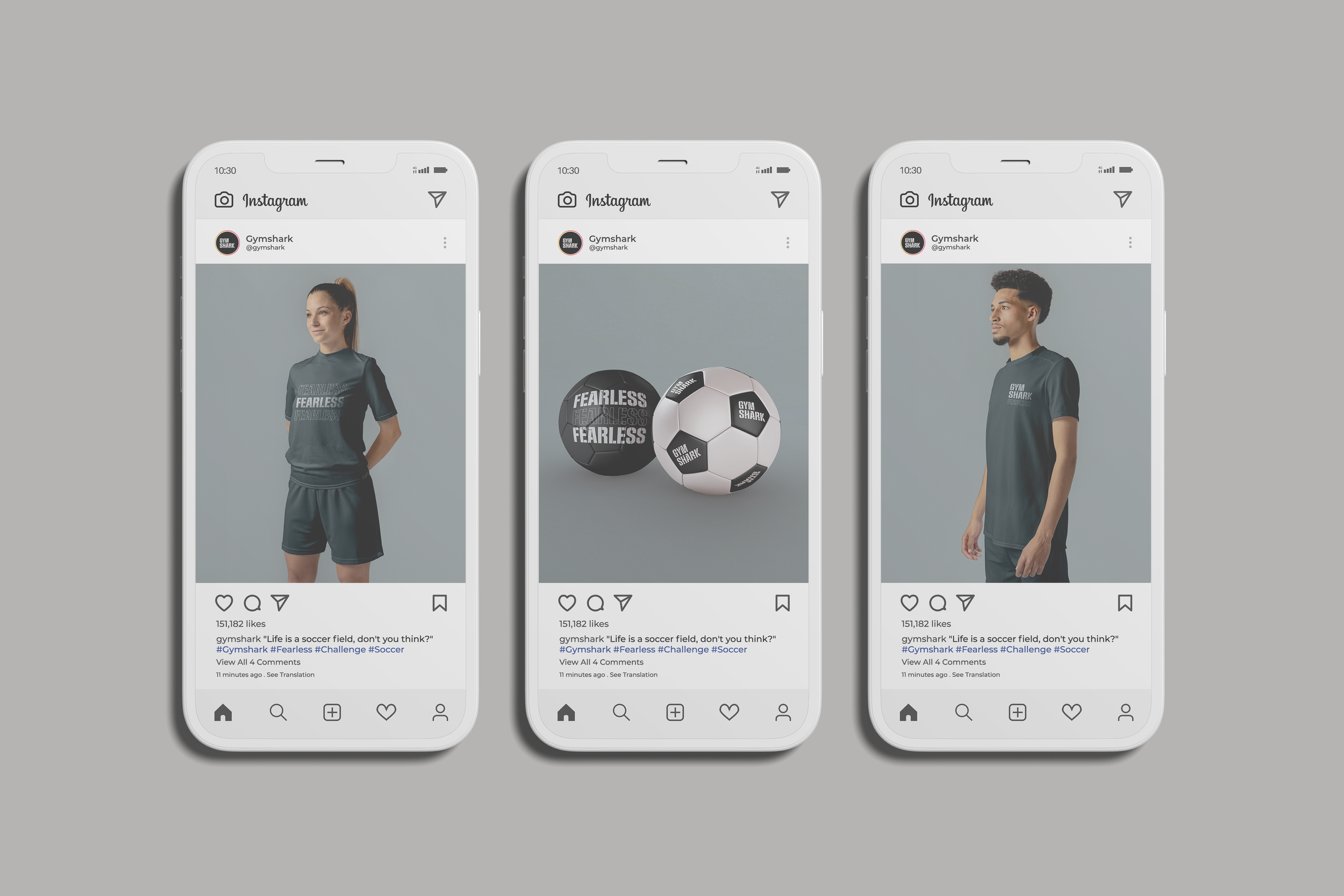
Branding in graphic design involves creating a consistent visual language across all touchpoints, including packaging, marketing materials, websites, social media, and other communications. This includes the use of consistent colors, typography, imagery, and messaging. Hence, I elongated the consistency of using a stencil look like typography as the pattern and allowed it to become a signature identity of GYMSHARK. 